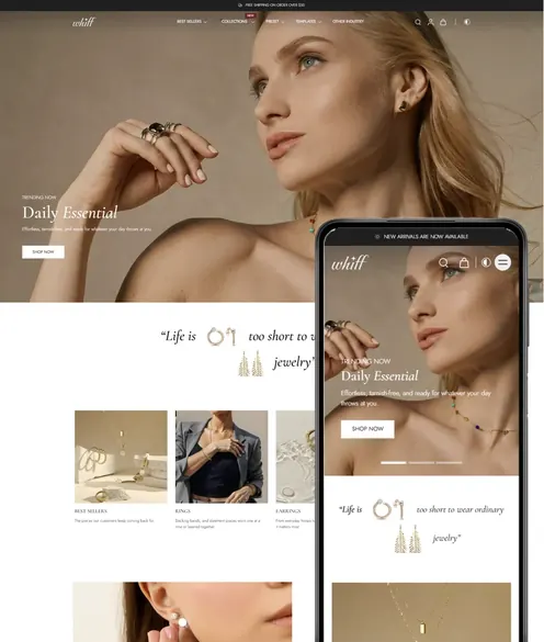
Homepage Sections That Work for Beauty Brands on Shopify

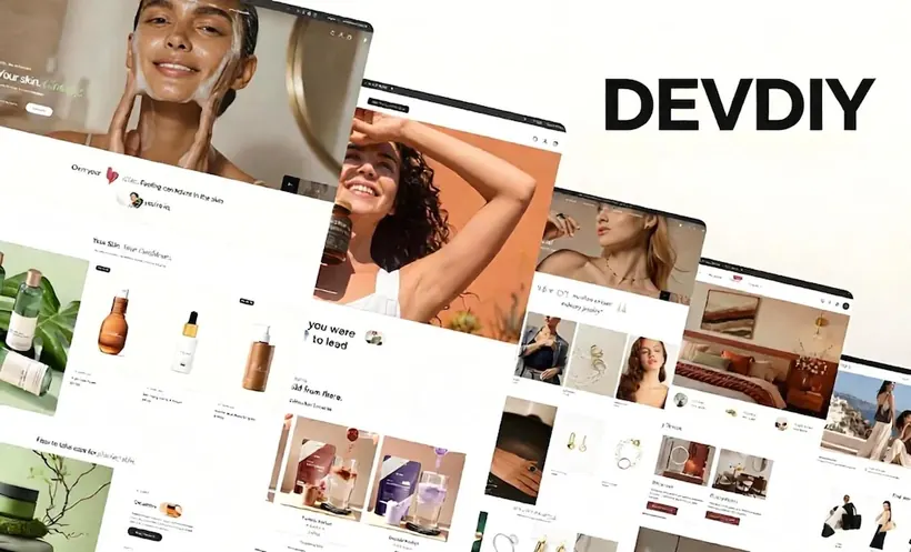
Beauty homepages fail in a predictable way. They open with a full-screen video, three announcement bars, and a grid of everything the brand has ever launched. The shopper, usually on a phone in the United States or Europe, still does not know which product to buy for their skin or their routine. On devdiy.com we rebuild those homepages as a short sequence of sections. The sequence is the design. The font is not.
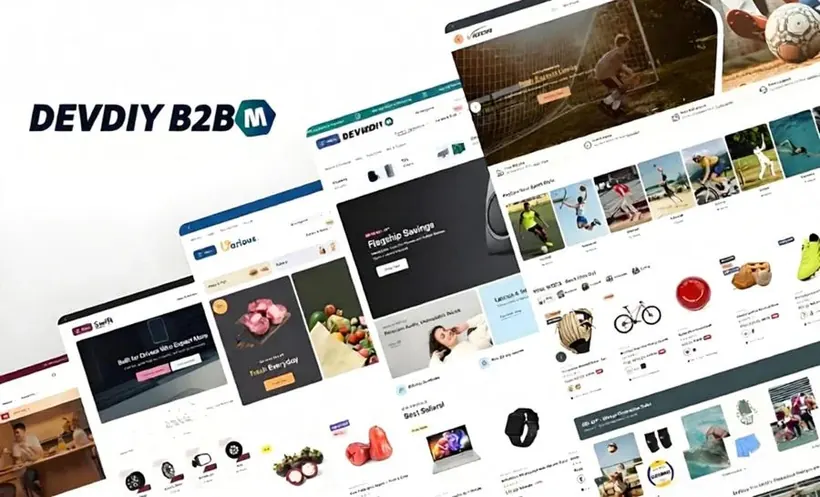
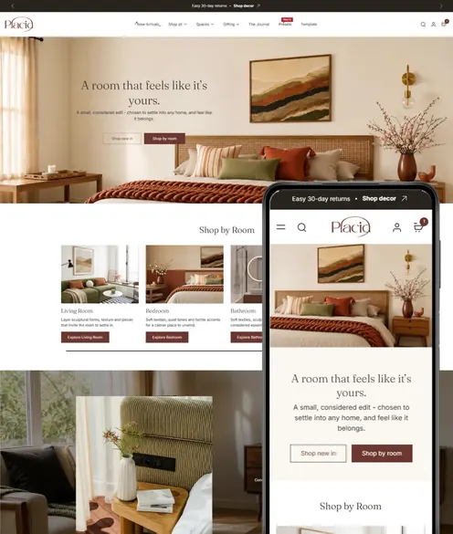
You can do this on a DEVDIY retail theme without a custom page builder. The constraint is useful. A section you cannot endlessly restyle is a section you have to fill with a real claim.
One hero, one job
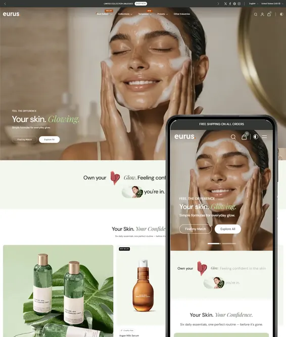
The first section has one job: name the product or the routine you most want a new customer to start. Put the product name in the heading, not a slogan about self-love, unless the slogan also says what is in the bottle. Add one sentence a buyer can check: who it is for, what it does in plain language, and how long a unit lasts. The button should go to that product or to a collection of three items, not to a page called Shop All.
If you are running a promotion, put the offer in the hero or in a single bar, not in both plus a popup. US shoppers are used to a code. EU shoppers are more sensitive to a price that changes between the ad and the page. Match the number. If the ad says twenty percent off the serum, the hero should not say “sitewide savings” and then exclude the serum in the fine print.
Show the routine, not the catalog
The second section should be a routine of two to four steps. Cleanser, treatment, moisturizer is enough. Each step links to one product, with a one-line reason. This is how beauty shoppers actually decide, and it is how you raise order value without a fake countdown. Do not show twelve steps. Nobody’s bathroom works that way, and the page starts to look like a flyer.
Use real textures. A smear, a dropper, a hand. Pack shots alone make a clinical brand look like a marketplace listing. If your photography is uneven, use the best images on the homepage and keep the weaker ones on the product page until you reshoot. A DEVDIY image-with-text section is enough. You do not need a custom before-and-after slider that hides the product name.
Ingredients and proof, in that order
Beauty buyers in Europe will look for the ingredient list and for claims you can support. Buyers in the United States will look for reviews and for a shipping window. Give both, close together. A short ingredient section can name three ingredients and what each one is doing, in language a non-chemist can repeat. Link to the full list on the product page. Do not invent clinical language. If you do not have a study, do not imply one. Regulators and customers both notice.
Proof is reviews, press you actually earned, and a clear returns line. Put a handful of reviews that mention a result and a skin type, not a wall of five stars with no text. If you sell into the EU, say where you ship from and the typical delivery window. Surprise customs math is not a brand experience. If you cannot ship a country, say so before checkout, not in a help article nobody opens.
What to leave off the homepage
Leave off the founder novel, the infinite logo carousel, and the second popup. Leave off a blog feed unless one article directly helps the hero product. Leave off every collection you are proud of. The collection page exists so the homepage does not have to. A homepage that is finished in six sections will outsell a homepage that is “complete” in sixteen, because the six-section page still has a button above the fold on a phone.
Check that fold on a current iPhone and on a mid-range Android, not only on your laptop. The buy button, the product name, and the price or the starting price must be visible without a hunt. If a DEVDIY section is too tall, reduce the image, do not shrink the text until it is unreadable. Accessibility is not a later phase for a brand that asks people to put something on their face.
A launch order you can finish this week
Day one, write the hero sentence and pick the one product. Day two, build the routine with real links. Day three, add three ingredients and five reviews. Day four, set shipping and returns in plain text and place a test order to your own address. Day five, delete a section. The last step is the one teams skip, and it is the one that makes the page look designed.
When the campaign changes, change the hero and the routine, not the whole theme. DEVDIY sections are built so a merchant can do that in the editor. If you need a developer every time the season changes, the homepage is too custom. Keep the structure. Swap the product. That is how beauty stores stay current without rebuilding the store every quarter.
devdiy.com’s advice is stubborn on purpose. One hero, one routine, ingredients you can explain, proof you can point to, and a button that still exists on a phone. Everything else can wait until the first version is taking orders.